Real-time adjustment of UI elements- button size, and color based on factors like user behaviour, location, and accessibility needs. Automatically adapting text sizes, contrast and visuals to suit varying needs.
Detecting subtle signals such as typing speed, pause, location, alert search to infer emotional state and modify tone and visuals. Switching to calmer mode or alert mode based on the data inferred.
Integrating
Automatically send alert notifications to

This project focused on redesigning a personal safety mobile app .
The application is a mobile-first safety and incident management platform designed to help individuals Report incidents, manage safety alerts in real time and coordinate with trusted members during emergencies.
Business Goal:
To improve user engagement, reporting accuracy, and trust in the platform while reducing user drop-offs and incorporating new features.
Native Android and iOS Mobile App
| 1L+
Playstore Downloads
| 85%
Adoption in 3 months
| 145+
Screens presented
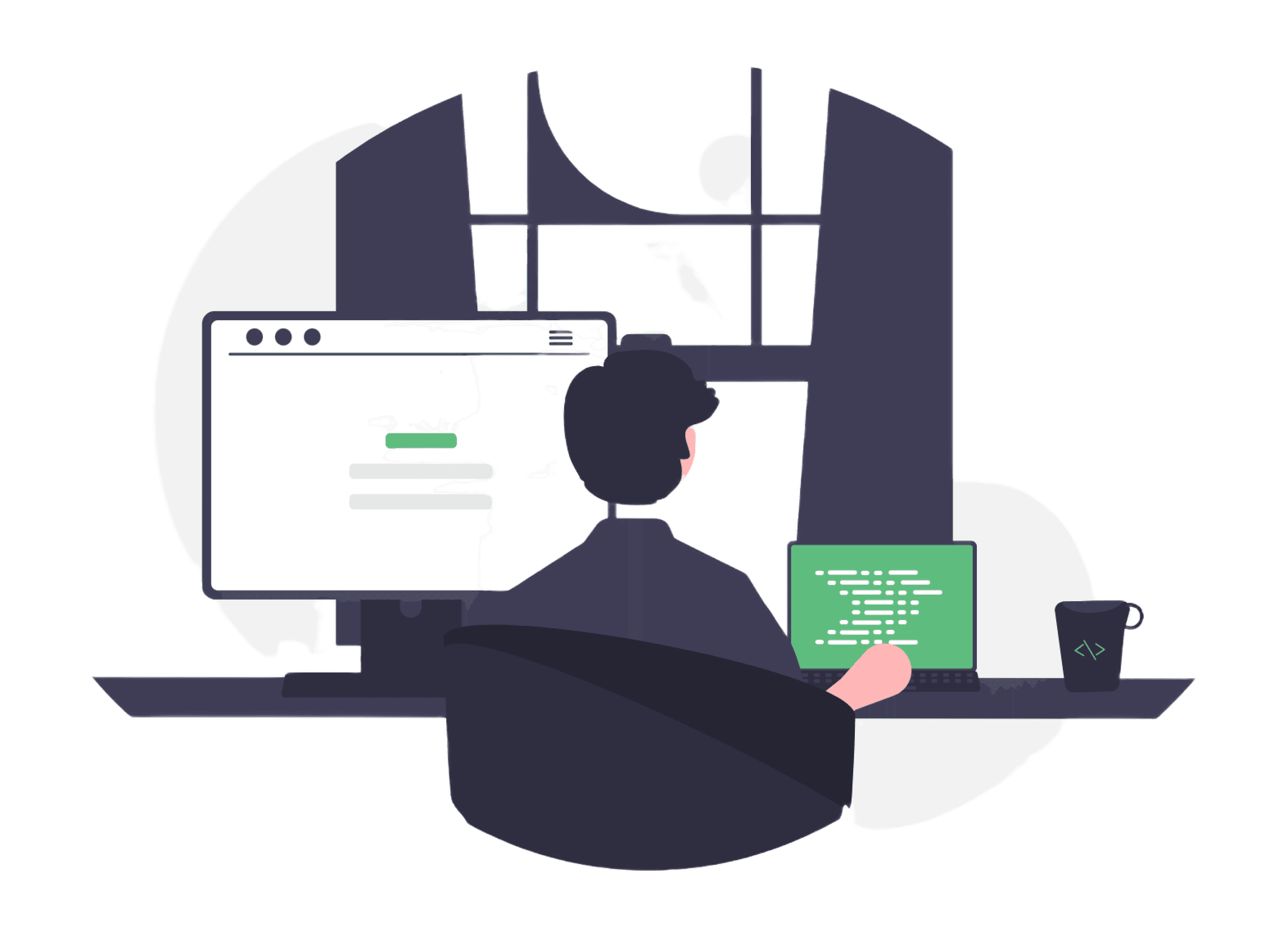
Reimagined a Real-Time Alert App for Personal Safety
Team
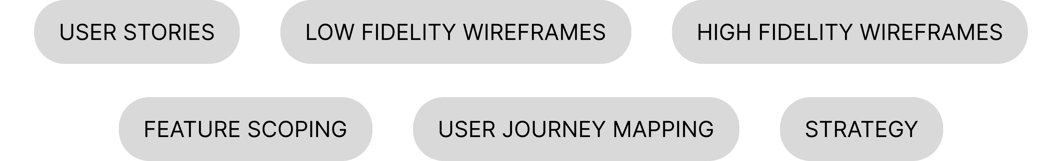
User Journey Mapping
User journey mapping revealed critical stress points during emergencies and helped streamline flows
User Persona
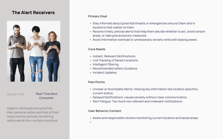
User personas allowed me have empathy guided design choices, understand mindset of stressed, panicked users, anticipating their reactions in emergencies.
Guardrails were vital for this project. After thorough analysis, I derived at the four Guiding principles to approach the project.
Design Approach
Simplify
Reduce friction in user
flows and navigation.
Adaptable
UI to accommodate
dynamic requirements.
Consistent
Uniformity across features and devices.
Scalable
For future growth
and features.
Thumb accessible design
Majority users rely primarily on one handed use.
Visual Scanning
In stress situations users overlook cluttered or text-heavy interfaces.
Alert Fatigue
Stacked notifications led to 60% of users missing urgent alerts.
Location influence
Location and surrounding influences user action during emergencies.
User Insights
Users in the U.S, primarily individuals concerned with personal and community safety, were studied—especially those prone to panic during emergencies and key Insights were gathered.
Designing Homescreen
The home screen was the most contested design space—where client expectations, developer feasibility, and user experience needs collided.
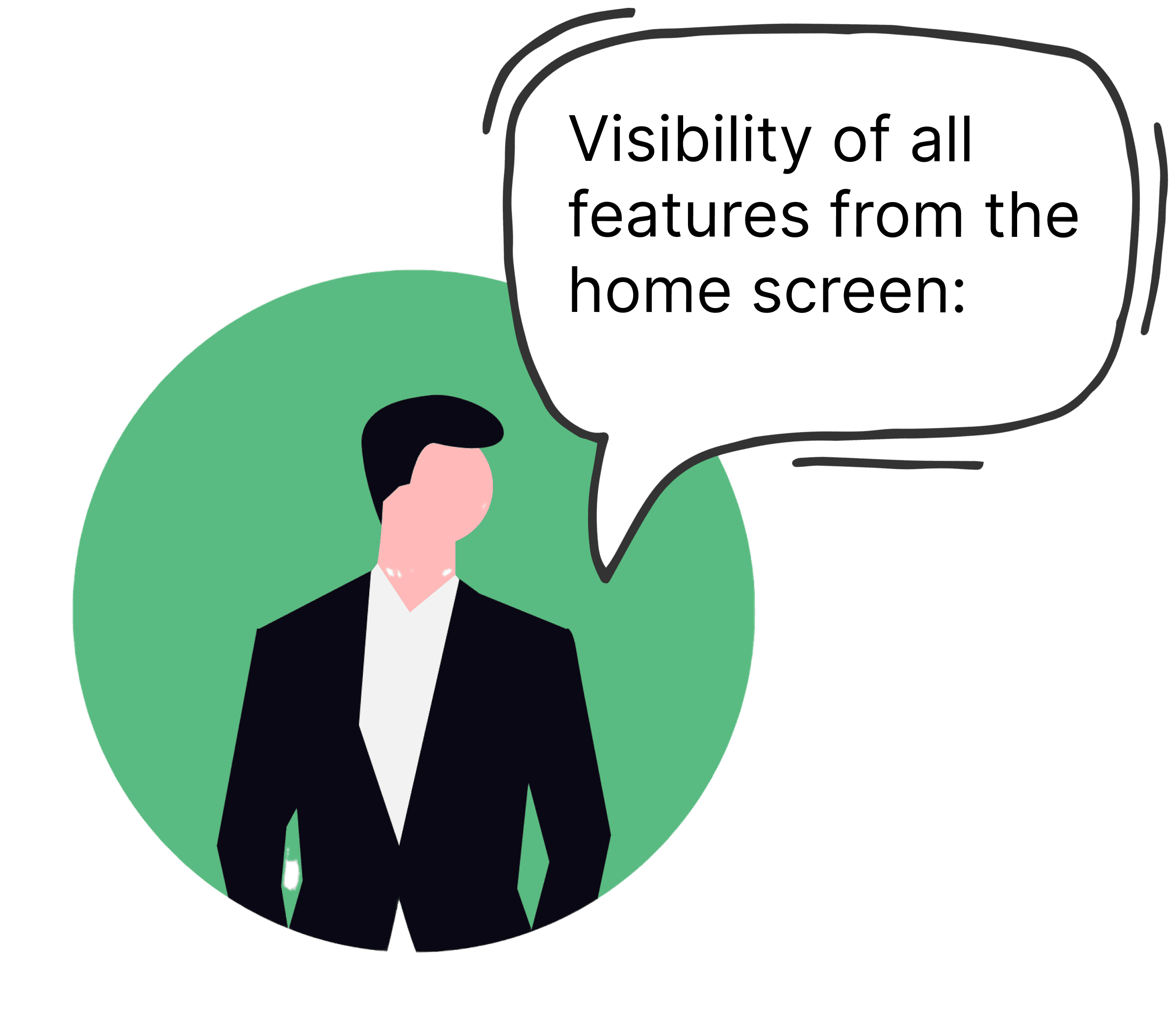
Client Requirements:
The client wanted easy accessibility of all features from the home screen: location pills for quick filtering, mapped alerts for geographic context, scrollable alert cards with details, and engaging micro-animations to humanize the experience.
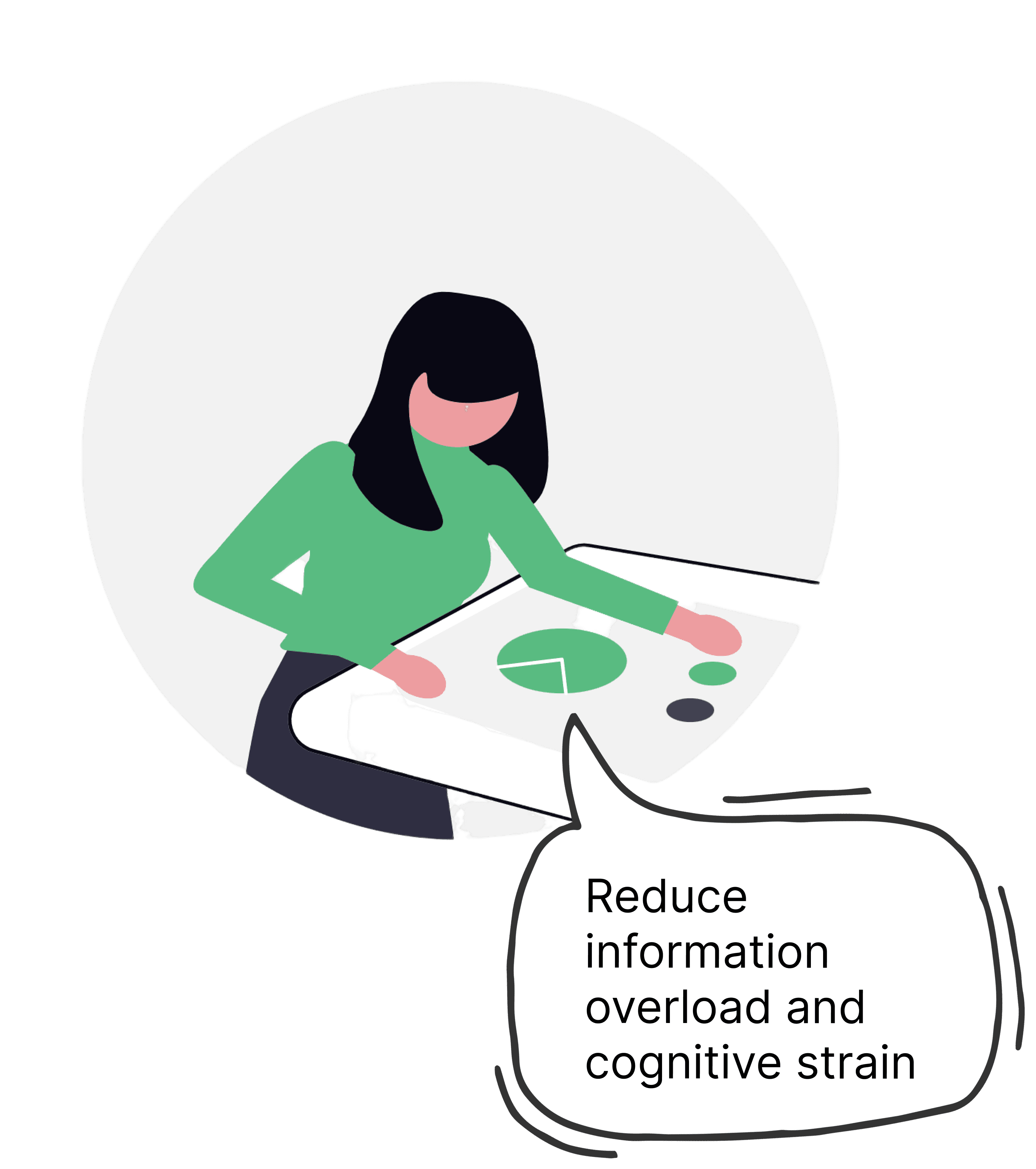
UX Pain Points:
This created risks of information overload and cognitive strain, especially in emergency scenarios where users must act instantly. Testing showed users often scanned past critical alerts or got distracted by too many parallel elements.
Product Challenges:
The tension lay in balancing richness vs. speed: the need to show comprehensive safety information while ensuring fast load times, fluid animations, and glanceable clarity. Every extra visual element risked lag, battery drain, or delays in life-critical alerts.
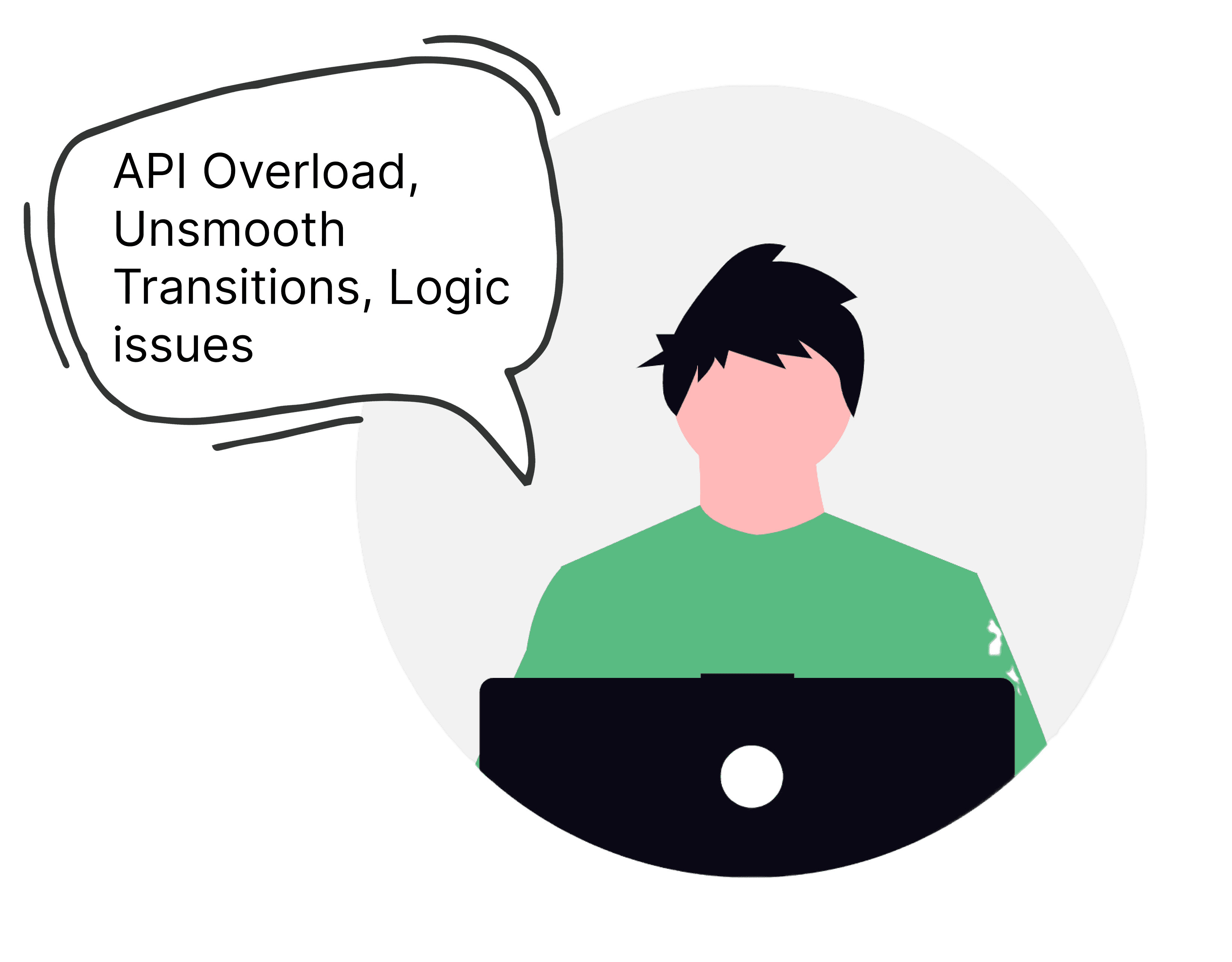
Developer Constraints:
Developers raised concerns about API overload when simultaneously pulling location data, live alerts, and animation triggers. Smooth transitions across cards and micro-interactions strained performance, especially on mid-range devices.
Unresolved Issue:
User Discovery Without Phone Number Mandate
Scope for AI Integration
Reflections
Project Coordinator
Front end Developers
Back-end Developers
Android and
iOS Developers
UX and UI Designers

As the lead UX contributor for a safety-focused mobile application,
I was responsible for defining and delivering critical user-facing features that balance real-time responsiveness, privacy, technical feasibility, and emergency responsiveness.
Tools Used: Figma, FigJam, Miro, Open Project, Chatgpt
My Role: UX Analyst

The app had grown rapidly over time, resulting in:
Navigation Challenges:
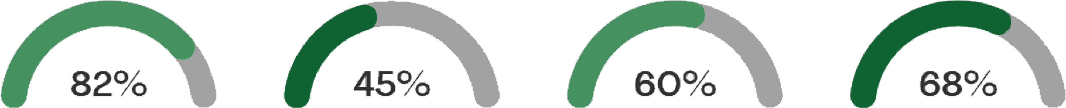
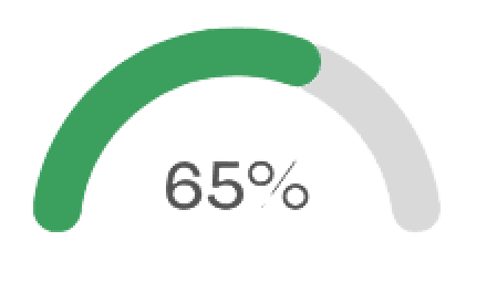
Navigation pathways became unintuitive, forcing users to dig deeper for core tasks. Usability Testing show 2.8s average scanning time, which is 86% slower than benchmark for emergency readability.
Increased Friction:
Screen hierarchies lacked logical grouping, causing cognitive overload and resulted in unexpected exits mid-journey, weakening engagement.
Usability Testing stated 38% abandonment rate.
Privacy Concerns and Confusion
Ambiguity around data use created hesitation while content redundancy and feature overlaps confused both end users and internal teams.
Problems Identified

Color System
Challenge: Too many KPIs meant multiple alert categories competing for attention. Earlier versions overused red, leading to user desensitization.
Design Solution: Used a tiered color system based on severity for alert filters- Red, orange yellow and green. Blue was used to represent unfiltered state.
Iconography and Button
Challenge: Icons were ambiguous and not intuitive.
Square, flat buttons were missed under stress scanning.
Design Solution: Adopted intuitive and relevant icons with high contrast for low-light visibility.
Rounded, pill-shaped elements used to improve recognition of CTA.
Insight
In panic mode, users glance at icons for <1s before deciding.
Touch Area and Screen Scanning Pattern
Challenge: During emergency situations and panic mode, mis taps are frequent.
Initial design had long scrolling lists leading to buried alerts.
Design Solution: Primary CTAs placed in bottom 60% of the screen.
Hit targets expanded to 48px minimum to account for shaky hands under stress.
Adopted glanceable card layout with quick info.
Insight
Most users under stress rely on color + position scanning first before reading text.
Impact
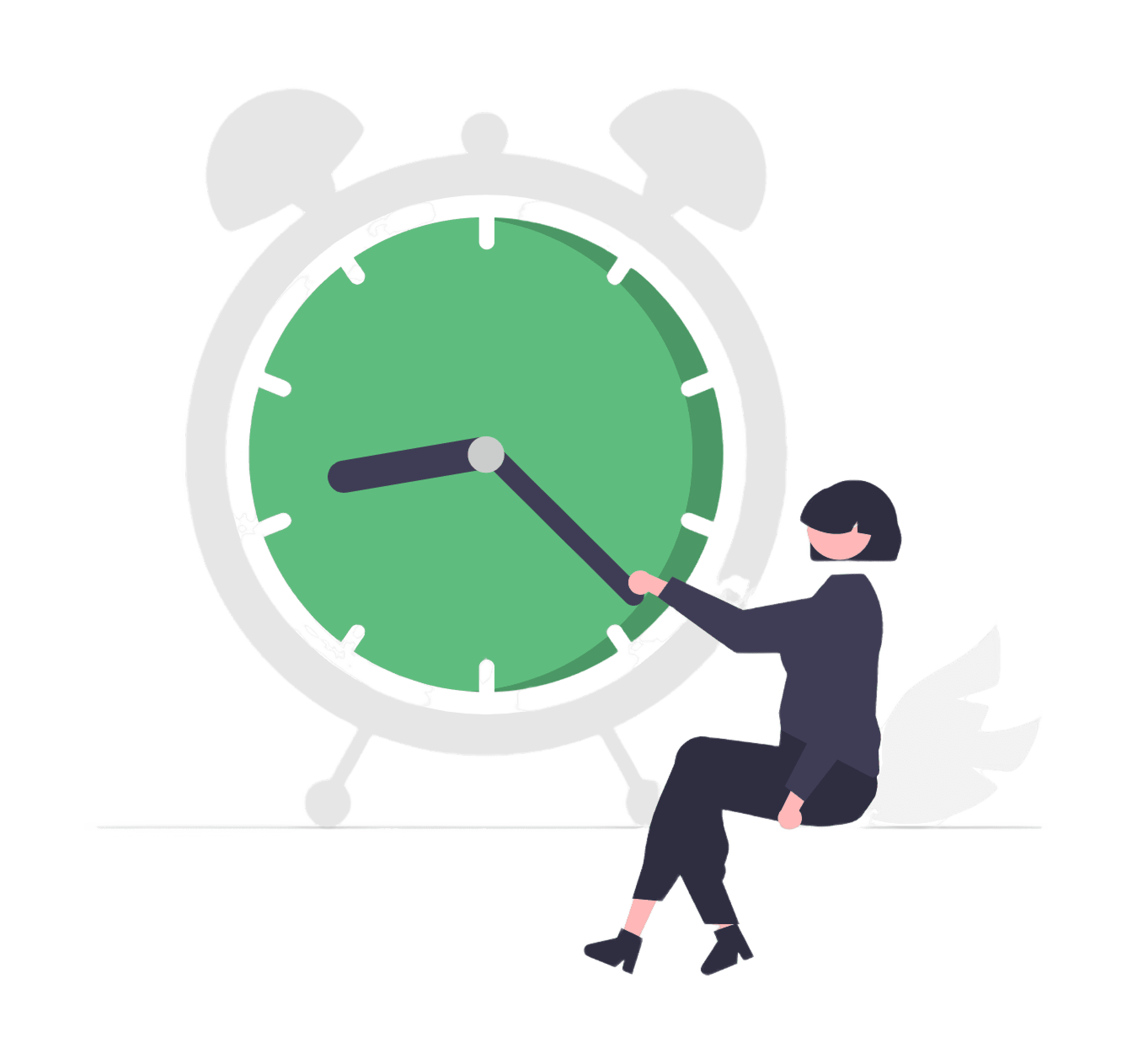
Users acknowledged critical alerts 2.2s faster on average.
Improved alert recognition accuracy by 35% in testing.
Key Design Decisions
Impact
heatmaps showed 20% less mis taps.
Impact
Response action time dropped from 5.2s → 3.6s.

CONTEXT
The app aimed to build a community safety network by allowing users to:
Discover contacts already on the app.
Add new users and save them for future alerts.
Unlike messaging apps WhatsApp, Snapchat, the app did not mandate phone number entry during signup due to privacy and trust concerns.
KEY ISSUES
User Discovery Problem:
Without phone numbers, contact sync was unreliable.
Users couldn’t easily find which of their phone contacts were on the app.
Network Growth Problem:
Adding new people required manual entry, slowing adoption.
Hard to expand the safety network beyond direct referrals.
Privacy vs Utility Conflict:
Client’s Concern: Forcing phone numbers might deter signups and create trust issues (sensitive in U.S. privacy context).
Developer’s Concern: Contact syncing logic became complex without a unique identifier (phone number).
User’s Frustration: Couldn’t easily connect with known people, limiting the community safety value of the app.
DESIGN EXPLORATIONS
As the UX designer, I was tasked with designing screens and flows that:
Respected privacy-first constraints (no mandatory phone number).
Provided a logical, usable flow for adding and discovering contacts.
Balanced client, developer, and user expectations.
Alternative Identifiers: Explored options like email, unique usernames, or referral codes as substitutes for phone numbers.
Hybrid Flows: Designed flows where users could add a phone number voluntarily for easier syncing, but it wasn’t mandatory.
Created a progressive permission request — explain why contact access helps (“Find friends already using the app”) → allow opt-in.
OUTCOME
Through iterative design, the home screen was streamlined into a hierarchy:
Location pills simplified for quicker reach and less clutter.
Alerts and map were designed prioritizing the essentials and keeping it minimal.
Scrollable cards and micro animations redesigned for smoother API handling.
NOTE: DUE TO NDA REGULATIONS, FINAL MOCKUPS ARE NOT DISPLAYED.
Unresolved Tension: While designs allowed both voluntary phone number entry and manual contact management, the core problem of friction in contact discovery remained partially unsolved.

With a tight timeline, I learned to scope features carefully and focus on high-impact flows. Quick iterations, strong collaboration, and constant alignment with the program manager helped us move fast without compromising quality.
Being embedded in conversations with both developers and the program manager from the start made a huge difference. It helped me pre-empt technical blockers and shape solutions that were both desirable and buildable.
Integrating ads and subscription prompts in a safety-first app required thoughtful UI placement and user flow design. This reinforced my understanding of ethical UX—prioritizing trust while still meeting business needs.